It's easy to get a little snobby about trends in creative disciplines. After all, there’s nothing creative or innovative about keeping tabs on “what’s hot” — unless maybe you’re doing so just to continuously buck the trends.
But the fact is that creativity is a conversation.
A conversation that’s been ongoing since we first learned to recreate elements of our world in ochre and charcoal on cave walls. Since we learned to turn abstract marks carved in clay with sticks into packages full of meaning — i.e., language.
Trends are just the main threads in that sprawling, chaotic, polyphonous conversation. Whether we choose to adopt or resist them, our creative choices exist alongside these trends.
They provide context. Because what’s innovation if not a break from the normative? And what’s the normative but last year’s trends?
So, just like last year, I sat down with Webflow’s crackerjack design team and asked them to stare into their VR crystal balls and see what will define design in 2018.
Here’s what Sergie Magdalin, Ryan Morrison, Linsey Peterson, Nathan Romero, and Darin Dimitroff had to say. (Along with a few of my own thoughts, of course.)
1. Broken grid layouts
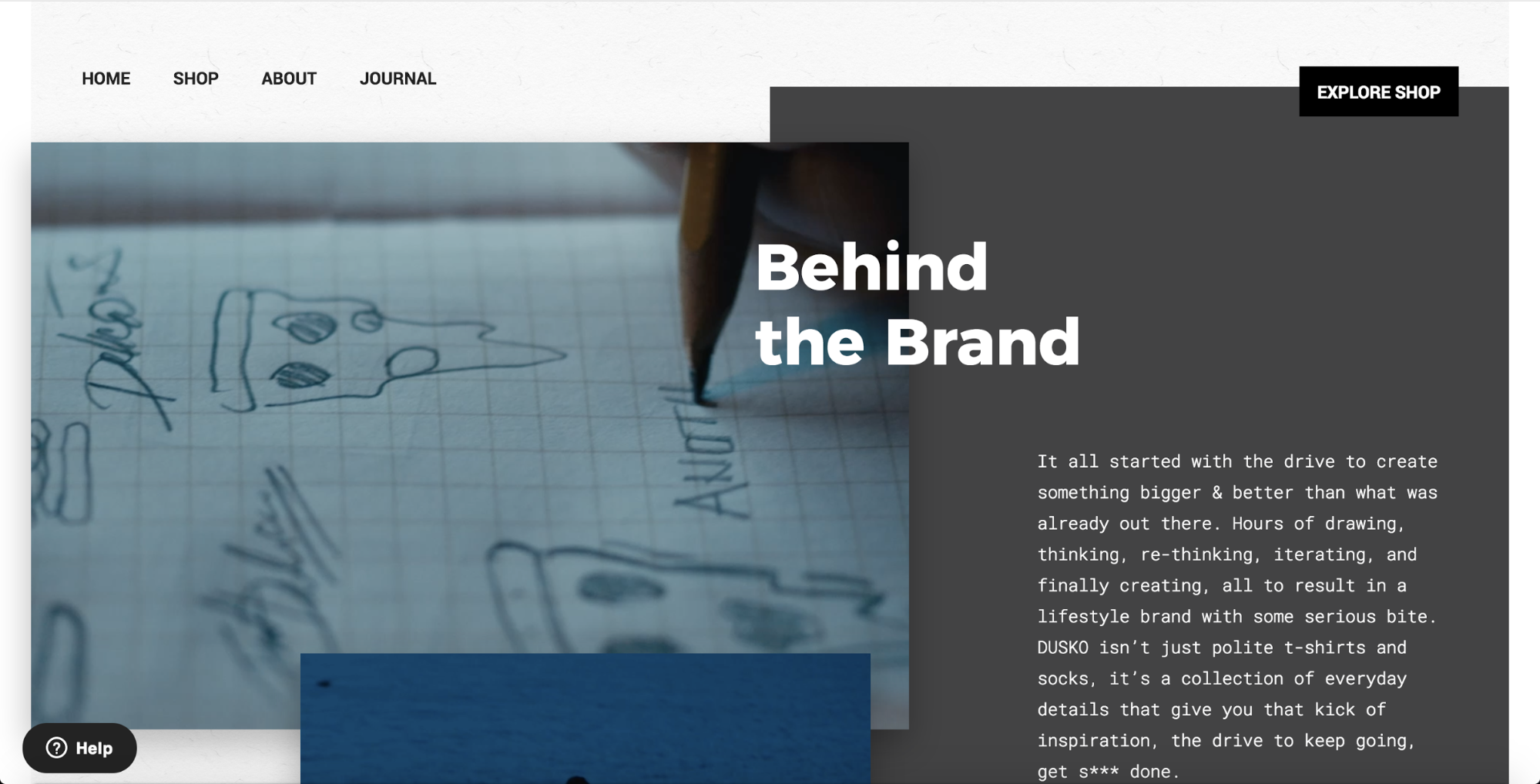
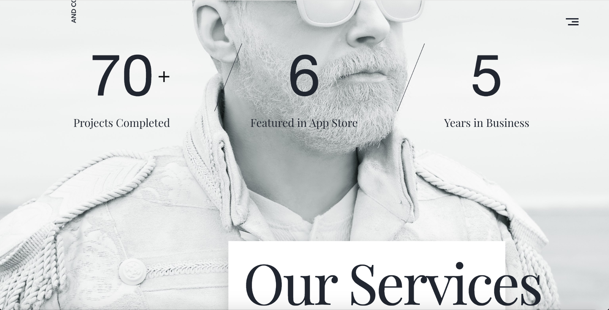
In designers’ neverending quest for more creative and engaging layouts, the grid we’ve always relied on to bring harmony and logic to our layouts has itself become a kind of constraint.
Which isn’t to say that broken grid layouts ditch the concept of the grid altogether — instead, they allow images and text elements to drift into and across the gutters that usually serve as hard stops in more sober layouts. Here, the usual discreet boxes of images and text begin to overlap and converge, often creating beautifully unexpected juxtapositions of bitmap and letterform.
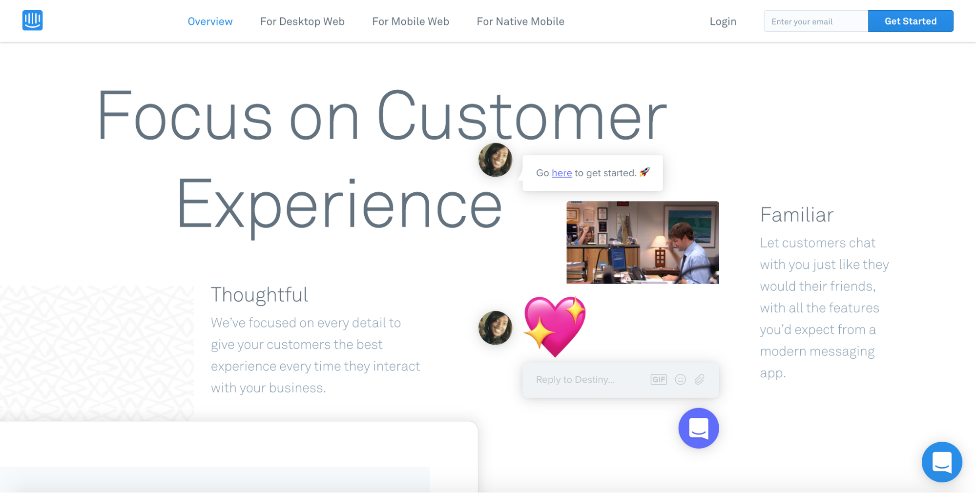
2. Illustrations take center stage

One of the more interesting challenges I’ve witnessed in the world of marketing digital products is that of image selection. I’ve watched whole design teams mull over the debate, usually ending up in one of two places:
- Product UI shots and GIFs
- Editorial/lifestyle photography
The former emphasizes the in-product experience, features, and functionality, while the latter tries to emphasize the product’s human dimension: the effect it has on people’s lives.
But heading into 2018, we’re seeing — and will continue to see — the work of illustrators attain an all-new prominence in both marketing and product design.
Why this is happening fascinates me, and I can’t decide exactly what it is. Perhaps it’s just the same cyclicality we’ve long observed in the world of fashion — after all, illustration dominated the advertising world up till the late 60s or so.
Or, maybe Dropbox’s design team was onto something with this explanation of their new illustration style:
We create rough sketches using graphite, then pair them with colorful, abstract shapes to bring the creative process to life. Our style is inspired by the moment when you first have an idea, and serves as a reminder that the “canvas is only blank until you make the first mark.”
I mean … they had to be onto something with this redesign ... right?
Illustrations can also be very powerful in bringing more abstract concepts to vivid life, as you can see in Shopify’s Polaris site. With a single drawing, Shopify clarifies that the Polaris design system is intended to serve as a guiding light — a north star — for every member of the team.
Finally, it’s worth noting that illustrations can also neatly resolve some of the representational challenges posed by photography.
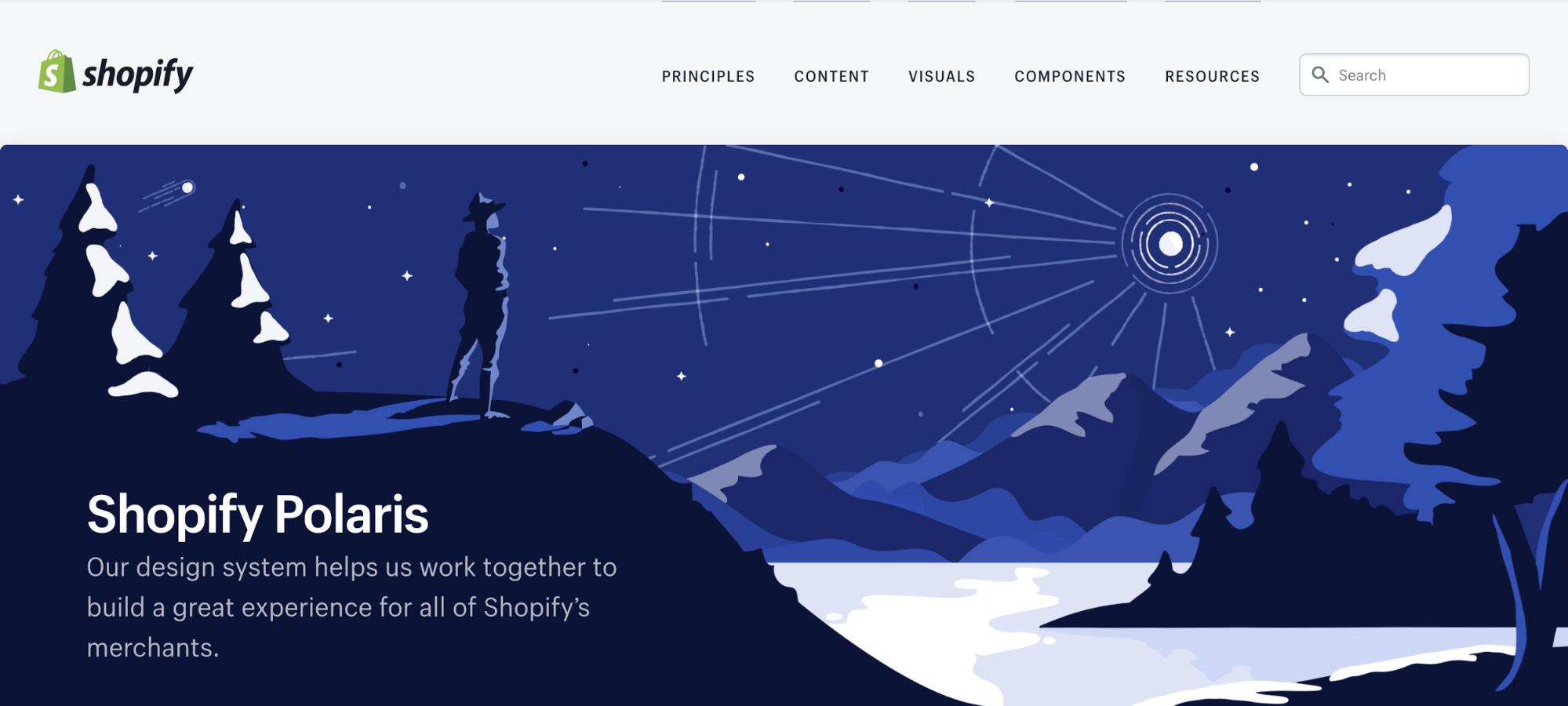
We build our digital products for a staggeringly diverse array of human beings — but the moment you capture a photo of a real human being and pop that photo into your website’s hero, that human being personifies your user. And leaves all other users unrepresented.
In contrast, the human being illustrated in Shopify Polaris’ hero image is just a human being. Specifiers like race, gender, nationality, and much more are left undefined, making it easier for any of us to project ourselves into the role of that lone thinker, contemplating the creative possibilities illuminated by a guiding light.
3. Brutalism reaches mainstream status
Early in 2017, we published an article touching on the rise of brutalism and sought to answer the why of the emerging style:
Brutalism ... is ripping open a space where designers can do what they want, rather than what they should. The works created here eschew all the optimization advice and best practices lists in favor of looks and effects that live in the jarring, and sometimes border on the offensive (to expectations, anyway).
So you can imagine our surprise when, of all site types, two ecommerce outlets jumped on the brutal bandwagon:
Balenciaga

Gucci

4. More organic and oblique shapes
Nature abhors a straight line.
–William Kent
Both web and mobile design have been dominated by card-based UIs for several years now. Until recently, most of those cards were (mostly) sharp-edged and right-angled, exposing the geometry of their underlying divs in an almost modernist concern for the materials of web design.
That’s changed in a big, big way in 2017. Now, every app from Google Now to Twitter to Facebook boasts almost aggressively rounded corners on their cards, input boxes, profile avatars, and more.

And it’s not just those primary elements growing more organic shapes. Backgrounds now abound with almost amoeboid blobs of color, dramatic diagonals, even dashes of the real world rendered almost cartoonish.
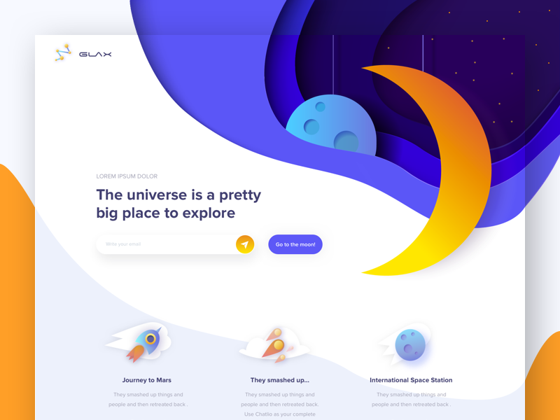
But designers aren’t just turning to organic curves in their never-ending search for a way out of the box. Many simply give those boxes a twist out of their usual 90° angles, freshening up their designs with a simple change of perspective, as on Stripe’s homepage.

All this isn’t to say that right angles are going to go the way of the dinosaur. We’ve also seen several sites double-down on straight lines — and mix them effectively with more organic and spherical shapes.

You’ll also notice the emergence of “flashing” or “vibrating” colors in many website UIs. While these color combinations create incredibly striking effects — including ghostly afterimages that seem to linger in your eye as you scroll on — it’s worth noting that they represent iffy territory from an accessibility perspective.
While accessibility is usually thought of as making a design user-friendly for the disabled, it’s worth remembering that even those with color vision can have a hard time with jarring color combos.

According to LinkedIn’s Accessibility Engineering Manager, Jennison Asuncion, accessibility can be defined as:
Designing and developing user interfaces that everyone, including people with disabilities, can independently consume and interact with.
That everyone is key.
5. Even more pervasive interactions and animations
The medium is the message.
–Marshall McLuhan
The web isn’t a static medium. Despite the enduring beauty and truth of pieces like Justin Jackson’s “This is a web page,” the web allows for so much more than just printing words on a page. And if McLuhan’s famous adage holds any water, that means that at least some of the web’s message — its meaning — lies in its capacity for motion and interactivity: the ability for a web page to not simply present us with information, but to make that information move and, more importantly, to allow us to interact with and impact that information.

Increasingly, as you scroll through the web, information isn’t just presented for your approval, but slides up into your awareness, calling attention to itself piece by piece.
Obviously, we shouldn’t go overboard here — there’s always the potential for animations to make otherwise delightful experiences overwhelming, especially for those with cognitive disabilities or sensitivity to motion.
But done right, even a subtle animation can direct the visitor’s attention to the right content at the right time, helping ensure they don’t miss vital lines of copy, or a conversion-driving form.
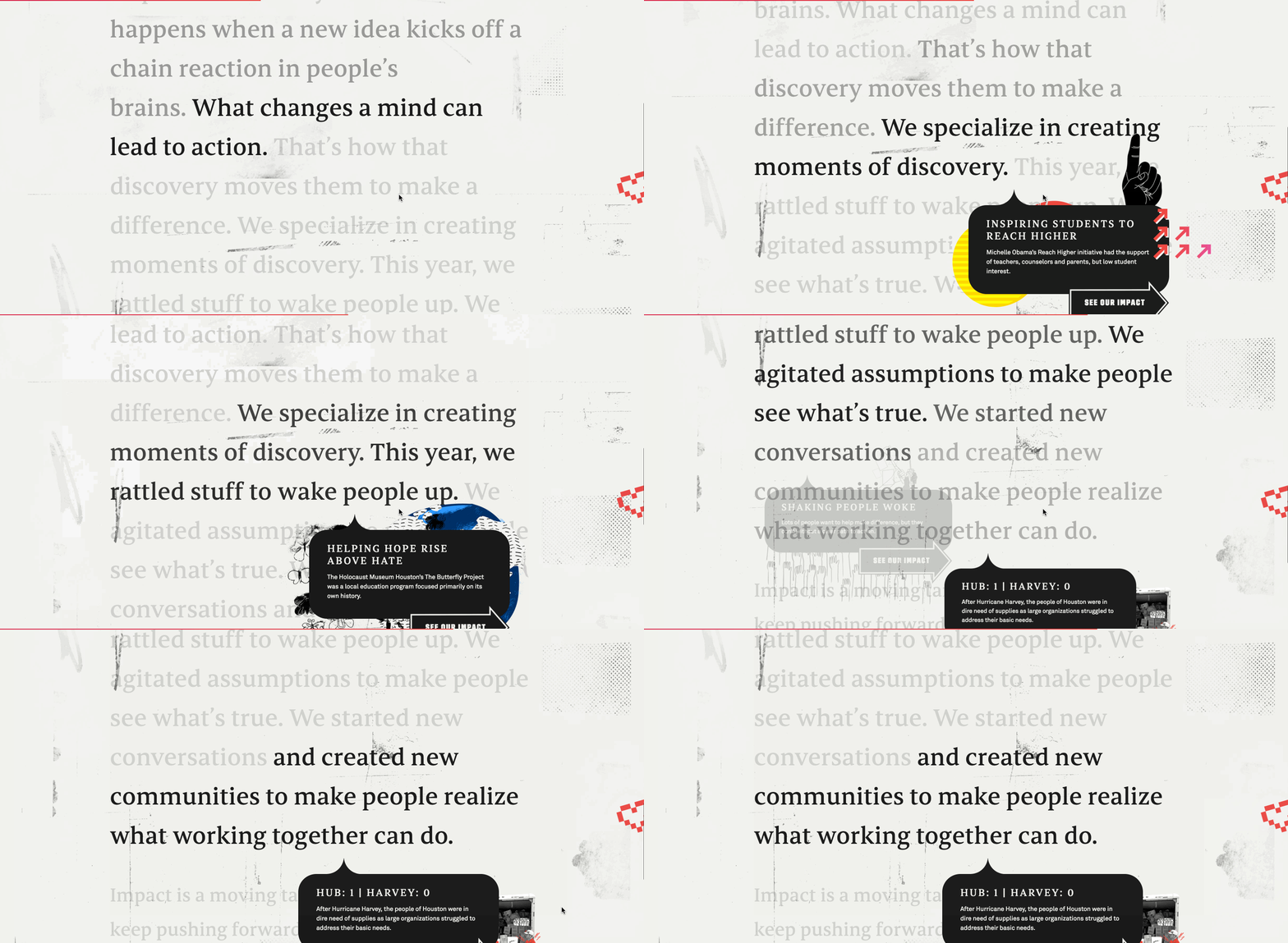
Take this gorgeous site Heco Partners built for the agency Black Sheep. As you scroll down, the highlighting of the “current” line helps keep you focused on the very well-written copy. Then a series of boldly designed tooltips start vying for your attention with the copy, crying out for you to stop reading and click over to another page. It’s a creative solution to the challenge of building an inline navigational system — but it can also add unnecessary tension to the experience for some users.
We’re also seeing a ton of tools arise to simplify the creation of more complex animations and interactions — long a gap in the digital designer’s toolkit — from our own Interactions 2.0 to Airbnb’s Lottie.
More specifically, we’re looking forward to more of two particular animation patterns: unusual scrolling rates and page transitions.
Unexpected scrolling rates

Parallax may be passe these days, but that doesn’t mean designers aren’t interested in linking scrolling to element movement in intriguing ways.
Take the site of Anna Eshwood, for example. Each photo on the site acts normally until you scroll past them, at which point they rapidly ascend, faster than your scroll rate. This gives the site an interestingly ethereal feel that plays nicely with the austere, monochromatic photos and their severe models.
As interactions and animations become an even more prominent part of our online experiences, expect to see more dashes of the unexpected thrown in to add spice.
Page transitions
In a web full of beautiful animations with the potential to clearly tell us “something has changed on this page,” it’s always felt a little odd that moving from one page to another feels pretty much the same, no matter what website you’re on.
A state-change animation might sweep you away from one page, and another greet you on the new page, but those are discreet, with nothing necessarily linking them. The transition itself looks like any other switch from page to page: things go blank for a sec, then the new page loads in. Nothing fancy.
But we’re starting to see more and more sites make that change in state something beautiful to behold. Take for example these transitions on the site of agency 3drops:

Here, the page transition keeps the experience cohesive and on-brand. You’re not so much “navigating to a new page” as you are accessing another “view” within a library of views. It’s a nice layer of polish to round out the presentation of a design-centric brand.

We have listed the top 5 and most encourage you to read the full article of the 19 trends from the source article linked below.
Author: John Moore Williams, Head of Content Strategy at Webflow
Source & Read full article: Webflow.com
All images and media are belongs to the source article.
Get in touch with Deegix to learn more on the new UI & UX trends, our chief designer will be delighted to provide advice for your website project.


